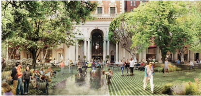
CommentsDESIGN--For Agence Ter's redesign of Los Angeles' Pershing Square, this rendering shows a human-scale view from the middle of the square looking out.
Rarely does anything with a photovoltaic canopy, a “great lawn,” no fewer than 13 design collaborators, and an estimated $50 million budget qualify as simple. But, relative to its competitors, that’s exactly what the winning design in the Pershing Square Renew competition is.
If all goes according to plan, by 2020, Los Angeles’ Pershing Square will be flattened, scraped clean and reintroduced to a public that has long crossed the street to avoid it.
Located in the heart of downtown, Pershing Square has aspired to be one of the country’s great public spaces — and failed miserably. [[https://nextcity.org/daily/entry/los-angeles-pershing-square-design-makeover ]] Twin forces of urban decay and atrocious, unwelcoming design have conspired to drive away would-be visitors for decades, leaving the square a notable exception in downtown’s steady revitalization. Nonprofit Pershing Square Renew was founded two years ago by developers and other stakeholders, including City Council Member Jose Huizar, who decided that enough was enough.
The organization sponsored a design competition that received submissions from a star-studded list of locally and internationally recognized design firms, each with expertise in architecture and landscape architecture. Out of 10 semifinalists, four finalists were chosen last month. Yesterday the team led by Paris-based Agence Ter was announced as the winner.
In many ways, the choice was obvious. Agence Ter’s design was the only one that met Pershing Square Renew’s guidelines.
Pershing Square is currently encumbered by bunker-style walls and various follies that, notwithstanding the ugliness of their early-1990s neon paint jobs, physically separate the square from the surrounding streets. The competition called for the opposite in the redesign: something that would open the square up and welcome visitors rather than intimidate them.
“We’ve said very clearly: Don’t approach this as the next wonderful portfolio piece that’s going to win awards,” Eduardo Santana, executive director of Pershing Square Renew, said in December.
That’s why it’s curious that the three other finalists submitted visions that I see as grossly over-designed. Fussy, even. The team led by James Corner Field Operations would have built an artificial hill on the square’s south side, thus creating exactly the type of barrier that Pershing Square Renew sought to eliminate. The teams of wHY with Civitas and SWA with Morphosis also operated heavily in three dimensions, with raised lawns and undulating structures.
The Agence Ter design is almost entirely flat, lowering the surface of the square so that it is flush with the encircling sidewalks. It aggressively bids adieu to the 1992 design’s purple tower and yellow walls with nothing more garish than trees and grass.
Its brilliance, or at least adequacy, is evident in a single rendering (top photo). It is not of a dramatic bird’s-eye view or of some cute feature like a grotto or miniature mountain. Rather, it is a human-scale view from the middle of the square looking out, such that the square’s grassy lawn visually blends in with the Biltmore Hotel across the street, with trees framing its Beaux-Arts entryway and a rectangular water feature lined up with the front door, as if the hotel and square had been built together. (They were, for the most part; one has just aged better than the other.)
Of the six official renderings that each of the four teams submitted, the Biltmore view is the only one of its kind — the only one that truly connects the square with the city.
The other designs also accommodated the subterranean parking garage that currently sits below the square more generously, making way for its curb cuts and protuberances. The Agence Ter design would spend a large portion of its $50 million budget to shave off the top five feet of the garage, thus achieving a double-benefit: a properly elevated square without extra funds to build ridiculous structures.
It’s hard not to speculate that the star power than went into the competition’s designs was, in fact, their undoing. Despite Pershing Square Renew’s calls for modesty, each included barriers and design flourishes that directed attention toward structures and away from people and the surrounding city.
They took their cues from the type of disembodied starchitecture that downtown Los Angeles knows so well — Frank Gehry’s Disney Hall, Diller Scofidio + Renfro’s Broad Museum, and Rafael Moneo’s cathedral, to name a few — and refused to give the city what it desperately needs: an inviting vernacular streetscape in which people can live rather than another object at which they can gape.
It’s notable that Agence Ter is French and is, therefore, amply familiar with the great, and simple, public spaces of Europe.
Pershing Square will never be Hotel de Ville. It may never even be Bryant Park. Indeed, until backers come up with $50 million, the new Pershing Square may never be built at all. But, by opting for flat instead of flash, Pershing Square Renew has already elevated the prospects for public spaces in Los Angeles.
(Josh Stephens is a freelance writer based in Los Angeles. His work has appeared in the Los Angeles Times, Planning Magazine, Sierra Magazine, the Huffington Post and the Los Angeles Review of Books. He is a contributing editor to the California Planning & Development Report and Planetizen. His website is joshrstephens.net. This review was posted originally at Next City.)
-cw
Explore
Our mission is to promote and facilitate civic engagement and neighborhood empowerment, and to hold area government and its politicians accountable.

 CityWatch Los Angeles
Politics. Perspective. Participation.
09
Sun, Mar


