CommentsWESTWATER’S DOWNDOWN--A few years ago, four finalists were telling Downtown LA & Boyle Heights residents why they were qualified to design and build the replacement for the fabled 6th Bridge that had long connected the two communities.
Half-way into one very long presentation, my Facebook page suddenly seemed … a lot more compelling. And as the next presenter approached the mike, a slide suddenly appeared that reminded me of the early 20th Century 6th Street Bridge - and yet equally felt as if it could have come from a future that didn’t quite yet exist.
In other words – it was the type of exciting architecture that used to be built in LA, but which is now only built in other places.
And I was suddenly excited that something that … different … might be built in Downtown LA. But then, I realized it had been a long time since the City of LA had built anything this different … just as I knew that upcoming politicians would shy away from anything that was … different.
But I was wrong. And at the next meeting of the two communities, Councilman Jose Huizar announced that this was the bridge the City was going to build.
Now let’s fast forward to early this year. First, there was the day the bridge that I thought could never be built, broke ground, and then there was the day I belatedly found out Huizar had recently announced the final four candidates for the redesign of Pershing Square. And after they finished their proposals, I found myself again watching another set of presentations.
But this time I had been able to see parts of each plan on-line and, even though one of the plans seemed the best, it was hard to tell from the small renderings what was really happening – or how they all fit together. But once I saw the blown up slides and other materials on a big screen – and each of the designers explained what they were actually doing – the one I had thought I liked, began to come together until it began to resemble a chess board of pieces – all working together towards a common goal.
And, I was … overwhelmed,
By the next morning, my subconscious had been given a real work out. I was finally realizing how deeply connected every part of it was. All the details of it.
As I grew comfortable with that, it began to feel as if it might actually be that long sought after, uncommon - common space; the elusive Holy Grail of urbanism. A space which makes those who enter it feel comfortable and a space where anyone can walk in and sense there might be some part of that space that will welcome them.
And for three days I walked and walked the park, the streets and the neighborhood– until it all finally made sense to me.
More on that in the next issue of CityWatch.
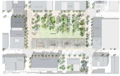
So here, in this initial post I will begin with the first of the second-best plans and why, while each of them were very good in many ways, they were less successful in other ways and a touch less daring than the Corner plan. First up is ‘Agence Ter and Team’ which is visually very attractive but which has a few problems – one of which may be insurmountable. If you look at the below diagram, you can see their plan removes all diagonal paths across the park. And that they have placed the huge lawn area – at grade – covering most of the square. That means everyone who walks through the park – will need to break their own trail - so to speak – until a very well-worn ‘X’ is dug into the middle of the grass lawn.

And that is the exact plan which USC had recently tried to implement on a huge grass area between its two main libraries; a grass area which instantly became a muddy grassless wasteland because absolutely everyone walked across the lawn exactly where the diagonal paths should have been until USC finally gave up and realized that overly optimistic planning could not defeat human nature or common sense - and dig up and replaced everything – and then reinstalled the diagonal paths.
This projects second problem is that if they put a concrete ‘X’ in the middle of this plan, that would destroy everything that works. And that is what is called being between a rock and a hard place. A possible third issue is that the entire park has been lowered to the height of the surrounding sidewalks (which is in itself, a very big ticket item) into one huge undifferentiated space.
That means that any place you are in the park, you will be able to see every single car on Olive, Fifth and Sixth Streets as they drive by the park. And the cars will be whizzing by all three sides of the park with just a short curb separating the cars, their noise and their car exhaust from the park.
And if a car does jump that curb – there will be little to stop it.
And that is the type of close examination every one of the projects will need to have. And I’ll finish looking at the plans in the next issue of CityWatch.
(Brady Westwater is a writer and a longtime contributor to CityWatch. He is president of Westwater Films and Media.)
-cw


