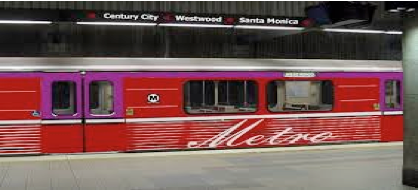
CommentsTRANSIT TALK-Change the Purple Line before it’s too late. Metro is proceeding with the construction of this subway extension. From the Metro website, “From the current terminus at Wilshire/Western, the Purple Line Extension will extend westward for about nine miles with seven new stations. It will provide a high-capacity, high-speed, dependable alternative for those traveling to and from LA’s “second downtown,” including destinations such as Miracle Mile, Beverly Hills, Century City and Westwood.”
This is all wrong. I do not mean the route of the subway, or the station locations, I refer to the color of the line. It is all wrong. Why? It shares tracks, stations and maps with the Red Line. These two colors are too similar in the color wheel. This leads to confusion for riders.
It is the same for Blue and Expo Lines which share lines, and both have shades of blue. For Expo it’s an Aqua color.
While similar colors may work from a design standpoint, and look attractive on maps in a designer’s and Metro offices, for the rider in a train station or on the train this color scheme is a disaster.
Differentiating between two very similar colors is difficult in dimly lit places, such as the 7th Street Metro Station, terminus for the Blue and Expo Lines and in some subway stations.
There are also problems of how well the colors print, and how badly the colors wear over time. With colors fading over time into similarities of each other, red and purple look the same, as do blue and aqua.
There are those who have difficulties with colors. A rider standing in a busy Metro station trying to read a Metro map where two separate lines have very similar colors is difficult enough in the best of days, but for those with color identification problems, or any vision problems, in dimly lit stations, they are faced with unnecessary obstacles.
Quick and easy identification of a light rail of subway is critical to the rider, particularly if the rider is new to the system. The sole mission of Metro is not to only build rail transit. Another critical mission, and indeed responsibility of Metro, is to take into consideration the complete riding experience, from those exploring Metro transit for the first time, to seasoned riders.
Metro and its designers have been using a black background for the rail line maps. In Metro stations this creates a visual black hole with two dots of similar color barely poking out from the blackness and the visual competition in the stations. It is worse when these posters are in shaded areas. This does not quickly communicate to riders which rail line is which color.
This is no small problem. Two rail lines of similar colors leads to rider frustration, anxiety, especially for transit riders, including this transit rider, and it does lead to riders to taking the wrong train, which this transit rider has done.
I have done this with the Red and Purple Lines. I’ve spoken with riders on the Expo Line who took the Blue Line because they couldn’t separate blue from aqua.
Once on the wrong train, the rider, once they come to the conclusion they are on the wrong train, then needs to exit at the next station and then wait for the next train traveling in the opposite direction to get back to the station which will get them onto the correct train. This is a colossal waste of time, and does much to discourage more people from riding Metro trains in the future.
I have a suggestion to stop the Purple Line coloring of the subway. Don’t use purple. True, the color has already been designated by Metro for this extension of the subway, but it is better to change it now before the line is built. This cannot be too difficult for Metro which in the course of a few years changed its name from RTD to MTA to Metro. Those changes must have cost a nice sum in printing costs, and other changes throughout the organization.
Give the color purple to the Crenshaw Line where no color has yet been designated. The Purple Line in the Leimert Park/Crenshaw Black American centers would not be lost in name association to the movie of the same name.
Take the aqua color and give that to the wrongly colored Purple Line. Then, for the Expo Line, go back to the original color proposed by for City Councilman Bernard Parks: rose. Rose is a lovely color.
With these changes the subway would have two distinct colors: red and aqua, and the Blue Line and Expo light rail lines would have two distinct colors: blue and rose.
These changes will go a long way to easing the frustration and anxiety of riding transit in Los Angeles. Another way to look at is that this is good for the rider. Doesn’t Metro want that?
(Matthew Hetz is a Los Angeles native. He is a transit rider and advocate, a composer, music instructor, and member and president and executive director of the Culver City Symphony Orchestra)
-cw
When You’re Trying to Get from Here to There in LA, Color Matters … Let Me Explain